Facelift in Melon style - What do you think of our new logo?
Share
Still recognise the melon?🍉 Why we changed it?
We are selling more and more home decor products. And we're planning new products. So we're no longer just selling creative hobby kits. The funny melon was a very cute logo for kids toys. However, it is not elegant enough for adult decorative products. So a new, cleaner logo with the melon "o" was created. Of course the meaning of the logo is the same: the "pep" which comes form pep up, and "melon" which means how cute we and our products are. ☺️

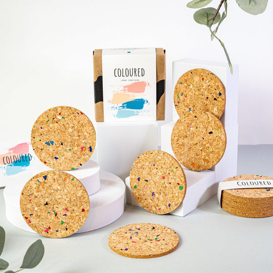
The little letter also symbolises what is most important to us, that we contribute to sustainable development with our products. You know, we use either cork, which does not require the felling of trees through 200 years, or recycled paper for our products and all our packaging.

We hope you also like the simpler version where only the melon remains with this clean new design. Would you like a colourful version? Or just for occasions, if we change the black?


